Contact ME

Use the form on the right to contact me. 


123 Street Avenue, City Town, 99999

(123) 555-6789

email@address.com


You can set your address, phone number, email and site description in the settings tab.
Link to read me page with more information.

Blog

BEST PRACTICES IN EXPERIENTIAL DESIGN

Stephen Wilson

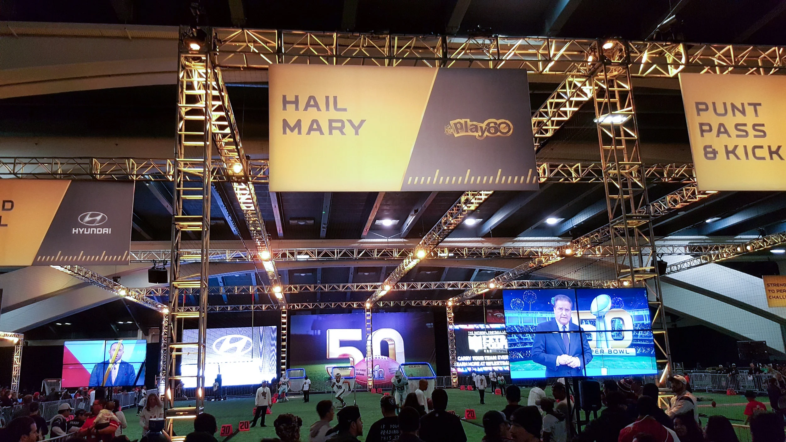
I was sent to Super Bowl 50 to do a competitive analysis. I was in charge of bringing back the best ideas from Fan Village, NFLX and the Media Gallery; as well as witness our activations in the real world. This would be the biggest collection of experiential activations I’d ever seen. 

At first, I was taken aback. As a designer, I initially preferred to think of things contained neatly in a template — existing within pristine white adobe art boards. At the Super Bowl, there were people, trucks, trussing, banners, screens, cardboard and stuff everywhere. All of this, thrown in dimly lit ballrooms, on top of wild carpets, where branded assets jockeyed for attendees' attention. It was a monstrosity. 

20160203_191156.jpg

After my head stopped spinning, I decided there was one more thing I must do while I was there. I needed to study this great particle collider of brands. I was inspired to learn how to create bulletproof experiential design that would survive in any environment. Here is what I came up with. 

USE THE BRAND COLORS

20160204_140134.jpg

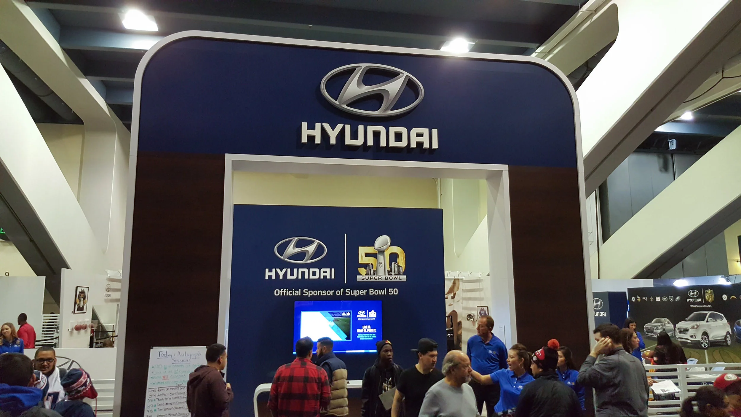
Full bleed images look great on gallery walls, but public spaces are visually chaotic environments. Using a brand's bold colors can push a signal through the noise.

CARVE OUT THE SPACE

20160203_183048.jpg
20160203_191457.jpg

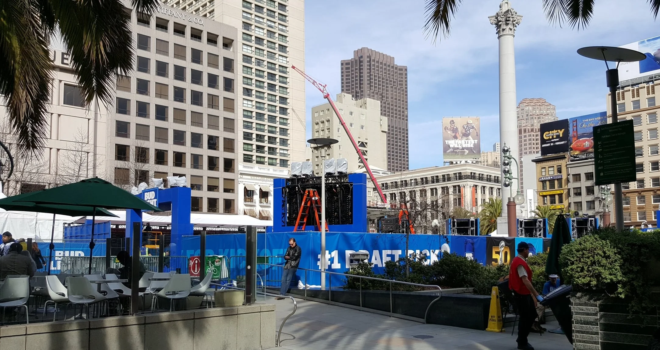
It’s easy to forget that an activation can be jammed in-between two or more others. Using physical structures like walls, flooring and barricades help to quarantine attendees’ attention.

AIM HIGH

20160203_183407.jpg
20160203_182439.jpg

Events are busy places, crowds will block the view of anything under six feet tall. Using things like marquees or flag banners push a brand high in the air so that it can be seen from far away. 

USE LIGHT

20160203_190240.jpg
20160203_181326.jpg

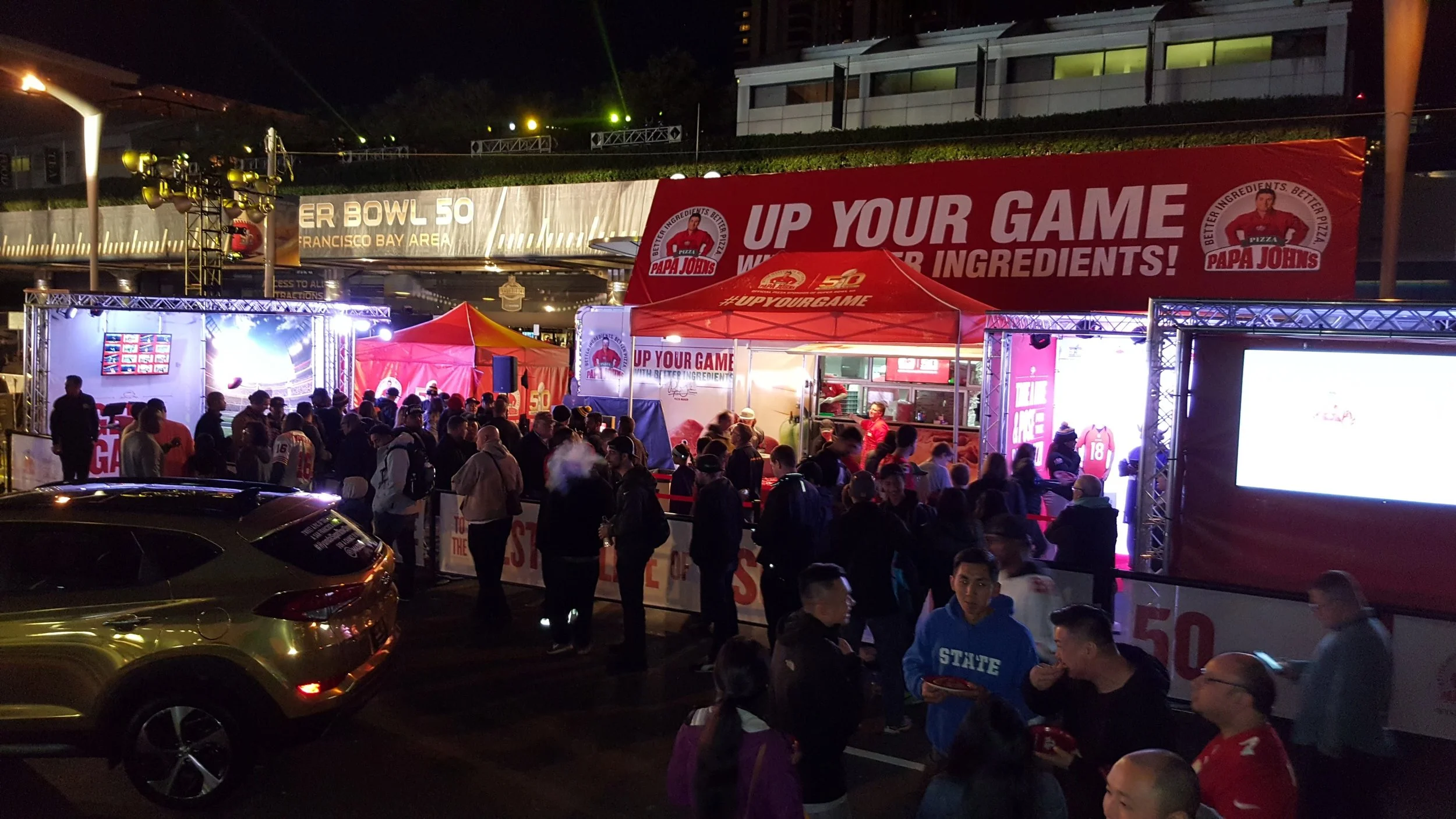
Everything can be perfect, but if an activation is stuck in a dark corner and adequate lighting is not installed, no-one will pay attention to it.

THINK IN 3D

20160204_123758.jpg
20160204_124900.jpg

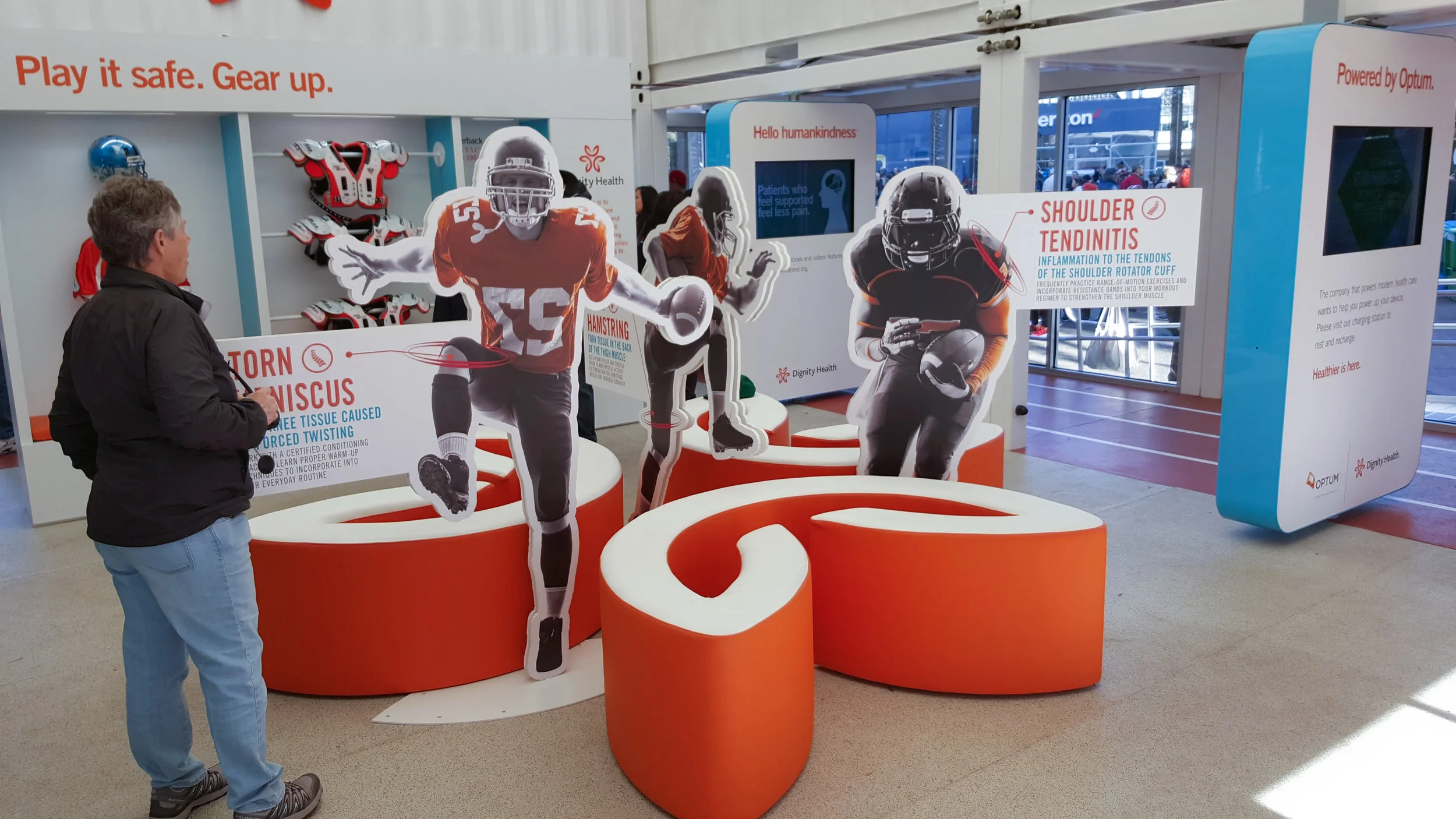
Using 3D type, sculptures, or dioramas wins the battle of short attention spans. 3D objects have a greater presence than flat prints. 

SIMPLIFY THE OFFERING

Picture1.png

Too many choices can overwhelm passers-by and cause them to ignore an activation. Also, having one big idea is better than a collection of inferior ones.

USE CALL-OUTS

20160203_184310.jpg
20160204_121037.jpg

The time people spend looking at and understanding the environment around them is measured in seconds. Make sure the attendees can understand what the offering is by using call-outs. 

BRAND NAMING EXERCISE

Stephen Wilson

A friend asked me to come up with a name for his new marketing start-up. Luckily, I had just finished reading The Making of a Name by Fraser Sutherland and Steve Rivkin. Below you will find five brand name concepts complete with mood graphics, a break-down, and a brand persona.  


CN_WROUGHTIRON_Page_01.jpg

Connotation

  • Combination of the abbreviation of Digital and Experiential

Denotation

  • It's normal to use acronyms for advertising agency names, but this is using it in contrast to the norm

Sounds like

  • FX and other things with X

Sound quality

  • powerful, 2 plosives
  • 3 syllables
  • Easy to pronounce

Visual quality

  • 3 letters, simple

Persona

Rebel

  • Be bold, unapologetic and unwavering
  • Fight the status quo
  • Value freedom
  • Inspire shock
  • Confront subjugation
 
CN_WROUGHTIRON_Page_03.jpg

Connotation

  • Wordplay on the word fascinate: to draw irresistibly the attention and interest of 
  • Derived from what we want to cause in our target audience

Denotation

  • Allure, fun, captivating, entertainment, sports

Sounds like

  • A cool squad, like oceans 11

Sound quality

  • 3 syllables
  • Easy to pronounce
  • Repeating vowel pattern

Visual quality

  • 6 characters
  • The 8 at the end is a visual target

Persona

Entertainer

  • Be entertaining and charismatic
  • Put on a show
  • Value freedom
  • Inspire joy
  • Confront familiarity
 
CN_WROUGHTIRON_Page_05.jpg

Connotation

  • Mountainous region of Greece
  • Derived from the word arcade, progression of arches. Symbolizing the iterative process that digital marketing employs to hone in on a solution

Denotation

  • Institutional, lofty, godly, classic

Sounds like

  • Common Latin derivatives

Sound quality

  • 4 syllables
  • Easy to pronounce
  • 2 plosives

Visual quality

  • 7 characters

Persona

Adventurer

  • Be daring and aloof
  • Go adventuring or provide adventure
  • Value surprise
  • Inspire wonder
  • Confront rigidity
 
CN_WROUGHTIRON_Page_07.jpg

Connotation

  • A division or contrast between two things that are represented as being opposed or entirely different.
  • Symbolizing the difference between digital and experiential

Denotation

  • Scienctific or exotic

Sounds like

  • Ducati
  • Any word ending in “onomy”: meaning, the study of

Sound quality

  • 4 syllables
  • easy to pronounce
  • 3 plosives

Visual quality

  • 6 characters

Persona

Shapeshifter

  • Be adaptable, resourceful, and expressive
  • Cause new thinking
  • Value common ground
  • Inspire astonishment
  • Confront narrow-mindedness
 
CN_WROUGHTIRON_Page_09.jpg

Connotation

  • Relating to the body, especially as distinct from the mind. A nod to experiential

Denotation

  • Technical, scientific

Sounds like

  • Automatic, a nod to digital, “So automatic”

Sound quality

  • 3 syllables
  • Easy to pronounce
  • 2 plosives

Visual quality

  • 7 characters
  • Easy to read

Persona

Scientist

  • Be logical and dedicated
  • Show how things work
  • Value knowledge
  • Inspire curiosity
  • Confront ignorance

REDESIGNING ARCHETYPES

Stephen Wilson

ArchetypesInfographic_F_2017_V6-02.jpg

The way that brand archetypes are commonly portrayed has always seemed a little random. I know that they're a proven tactic to manage a brand, but the descriptions provided read more like characters in a cast, as opposed to something that you'd use to help you build a website or campaign.

Recently, I saw the Myers Briggs personality infographic. Their infographic matched up with an archetype graphic I'd seen before.

I realized that archetypes aren’t necessarily characters, but a representation of the range of personalities within each of us. It wasn’t until then that I discovered that by using archetypes, you can resonate with people in a more authentic way, creating a more personal experience. This gave me the idea to make my own version of archetypes and change the things that I didn’t like, beginning with the word "archetype". I chose the word "persona" because I think it's more descriptive of the way it is used.

THE WHEEL

I arranged the 60 archetypes from Archetypes in Branding: A Toolkit for Creatives and Strategists in a wheel, based on the four base values I saw before: order, freedom, community, and individuality.

postit.jpg

THE 5 POINTS

I condensed the descriptions to five points: tone, theme, values, emotion, and opposition. I think more ground can be covered in a pitch or a workshop if the descriptions are short and simple. 

Tone: Usually applied just to writing, tone can also include the visual aspect of the brand.

Theme: The theme is a way to frame the actions of the brand. It's similar to tone, but can also be applied to things like operations, user experience, or product development. 

Values: Values help establish what is most important to the brand. This can shape things like content creation, philanthropy, sponsorship, and again… product development. 

Emotion: Thinking about emotion is a good way to measure the brand interaction. A user experience litmus test, if you will. 

Opposition: Defining opposition allows the brand to further define what it doesn’t stand for, completing a push-pull combination for great positioning.

ADDING CONTEXT

Once a persona is chosen, brand context is added to make an ownable narrative. I think this further helps sell the idea of using a brand persona for people that work within the brand, but may not be warmed up to the idea of using personas. For example, the guardian persona fits well with Franklin Industries’ product, goals, and market position.

The Guardian

  • Be wise, selfless and bold
  • Defend and protect
  • Value tradition
  • Inspire nostalgia
  • Confront degradation
FI_2017_BrandMission_V3-01.jpg